5 Ways of Wellbeing Project: Jog2Plog
A wellbeing app designed to encourage users to stay active and care for the environment through a user-friendly plogging experience.
Year
First
Year
2022-23
Role
UX/UI Designer

Stage 1. What are the 5 ways of wellbeing?

Stage 2. Research and Analysis

Stage 3. Intention and Name of App

Stage 4. User Personas
Basing it off Primary Research, creating user personas like Peter, Sharon, and Trevor helped me understand how different people experience daily life, motivation, and mental health. Each persona had unique goals and struggles, which taught me the importance of designing with empathy. This process showed me how tailoring features to real needs—like social connection, physical activity, or emotional support—can make a product more useful and meaningful.

Stage 5. Problem Statement

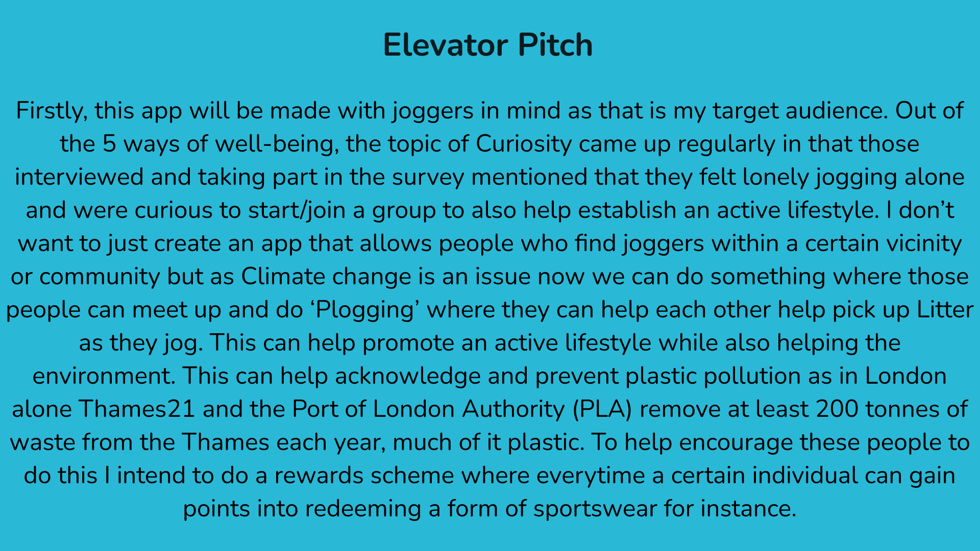
Stage 6. Elevator Pitch
Stage 7. User Flow/Journey
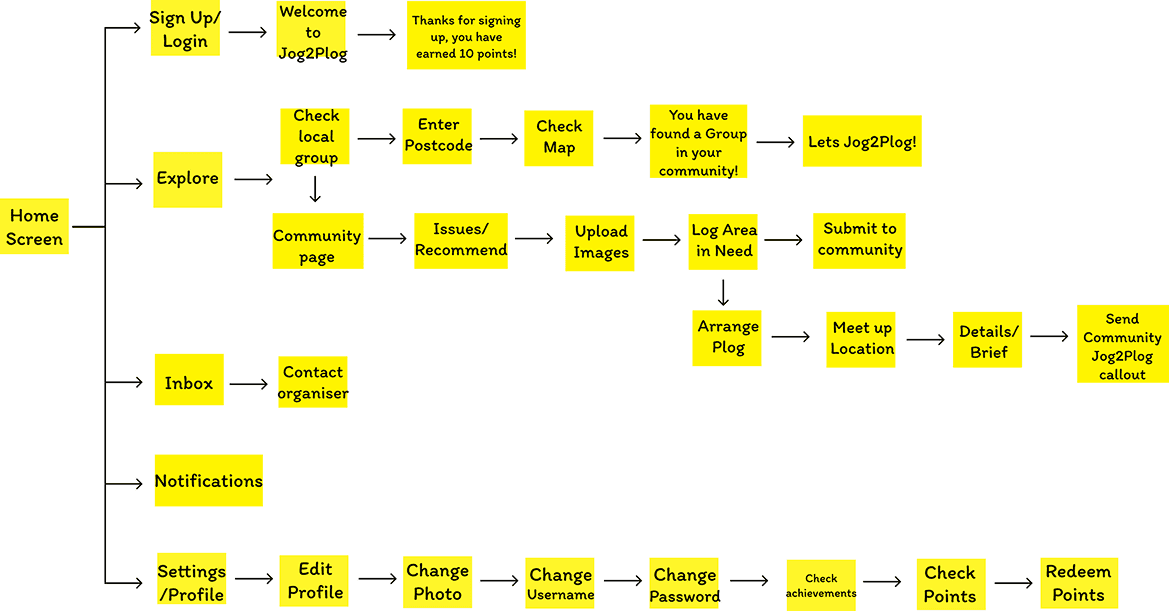
The user journey for Jog2Plog was designed around joggers who want to stay active while making a difference in their local community. The journey highlights the Five Ways to Wellbeing by encouraging users to connect with others, be active through jogging, take notice of local issues, give back by plogging, and keep learning through community engagement. From signing up and checking local groups to logging issues and earning points, every step of the journey supports a positive, purposeful experience for users.
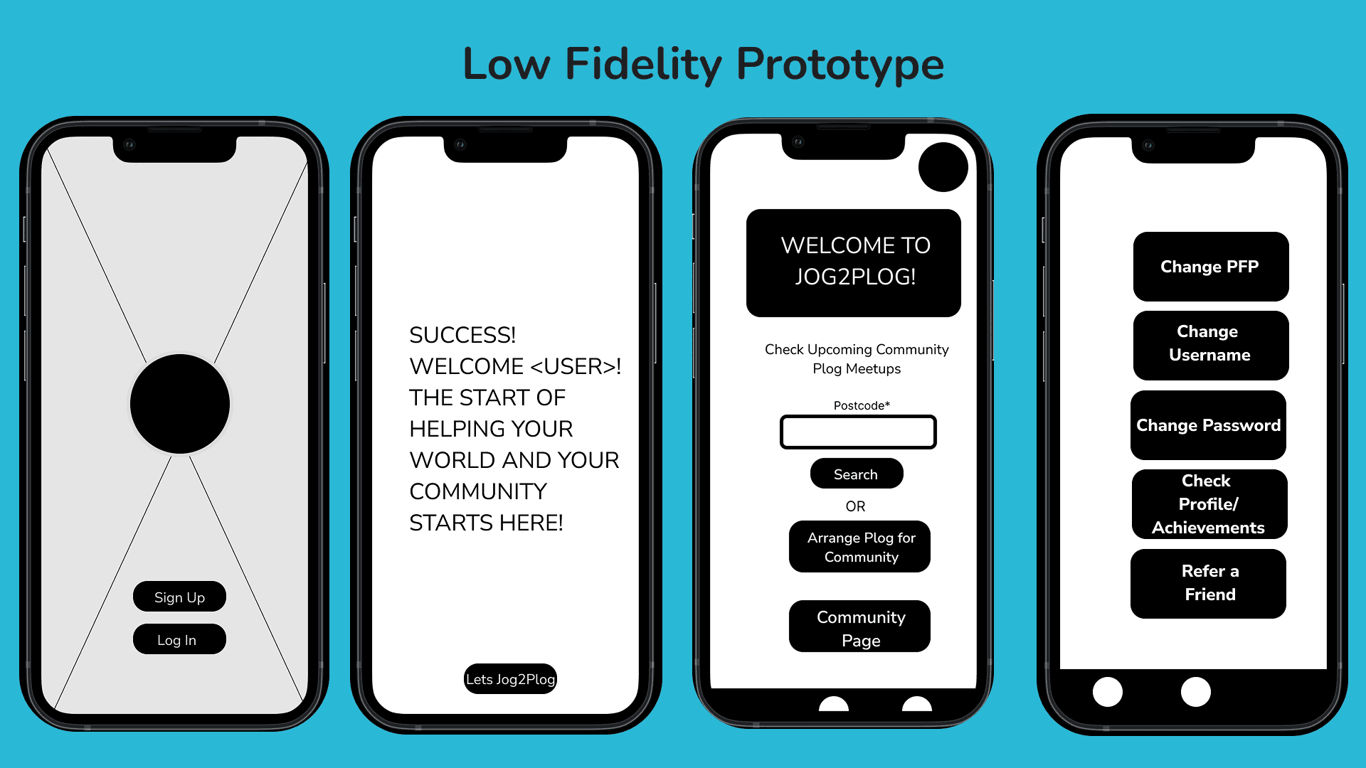
Stage 8. Low Fidelity Wireframes
These low fidelity wireframes helped me quickly map out the structure and key features of the Jog2Plog app. They allowed me to focus on user flow without worrying about visuals, making it easier to test ideas and adjust screens early in the design process. Each screen represents a core step in the journey, from signing up to checking community meet ups and managing profile settings. This stage gave me a clear foundation for building a user-friendly and goal-driven app.
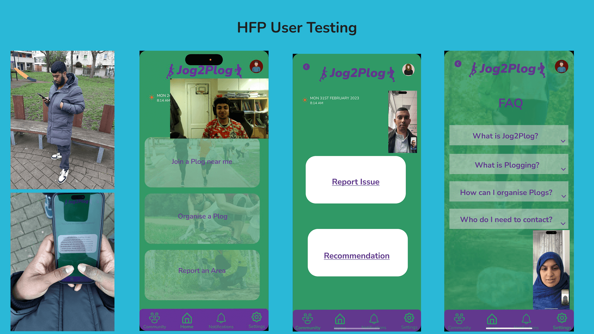
Stage 9. Low Fidelity User Testing
User testing of the low fidelity prototype provided encouraging and useful feedback. Testers found the app flow easy to follow and appreciated the clear layout of screens like the map and meet-up details. They liked how straightforward the login and community callout process was, saying it felt natural and motivating. Overall, the feedback confirmed that the concept was strong and the design was heading in the right direction for the target users.

Stage 10. High Fidelity Wireframes
The high fidelity prototype brought the Jog2Plog app to life with a clean and user-friendly interface. It focused on clear navigation, visual consistency, and real content. Features like location search, event details, and plog meet-up confirmation were refined to feel more realistic and engaging. The colour scheme and imagery reflect the active, community-focused nature of the app, helping users feel motivated and connected from the moment they sign in. This stage was key for final testing and getting detailed feedback.

Stage 11. High Fidelity User Testing
User testing with the high fidelity prototype received positive feedback for its clear layout, colourful design, and smooth navigation. Testers liked the bold buttons and said the app felt intuitive and easy to use, especially when reporting issues or exploring the FAQ section. The visual clarity and consistent branding made the experience feel professional and purposeful. Overall, users felt more confident using the app in real-world settings, which confirmed that the design was on the right track.
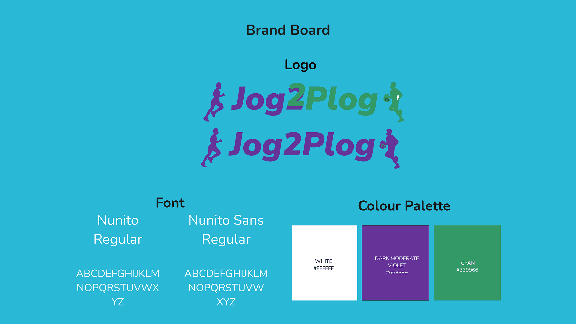
Stage 12. Brand Board
The Jog2Plog brand board sets a clear and friendly tone for the app. The logo uses movement and energy to reflect the jogging and plogging theme, while the colour palette of dark violet and green symbolises wellbeing, community, and nature. The Nunito font family was chosen for its clean, rounded style that feels modern and approachable. Overall, this brand identity helps the app feel trustworthy, active, and welcoming to users who care about staying fit and giving back.
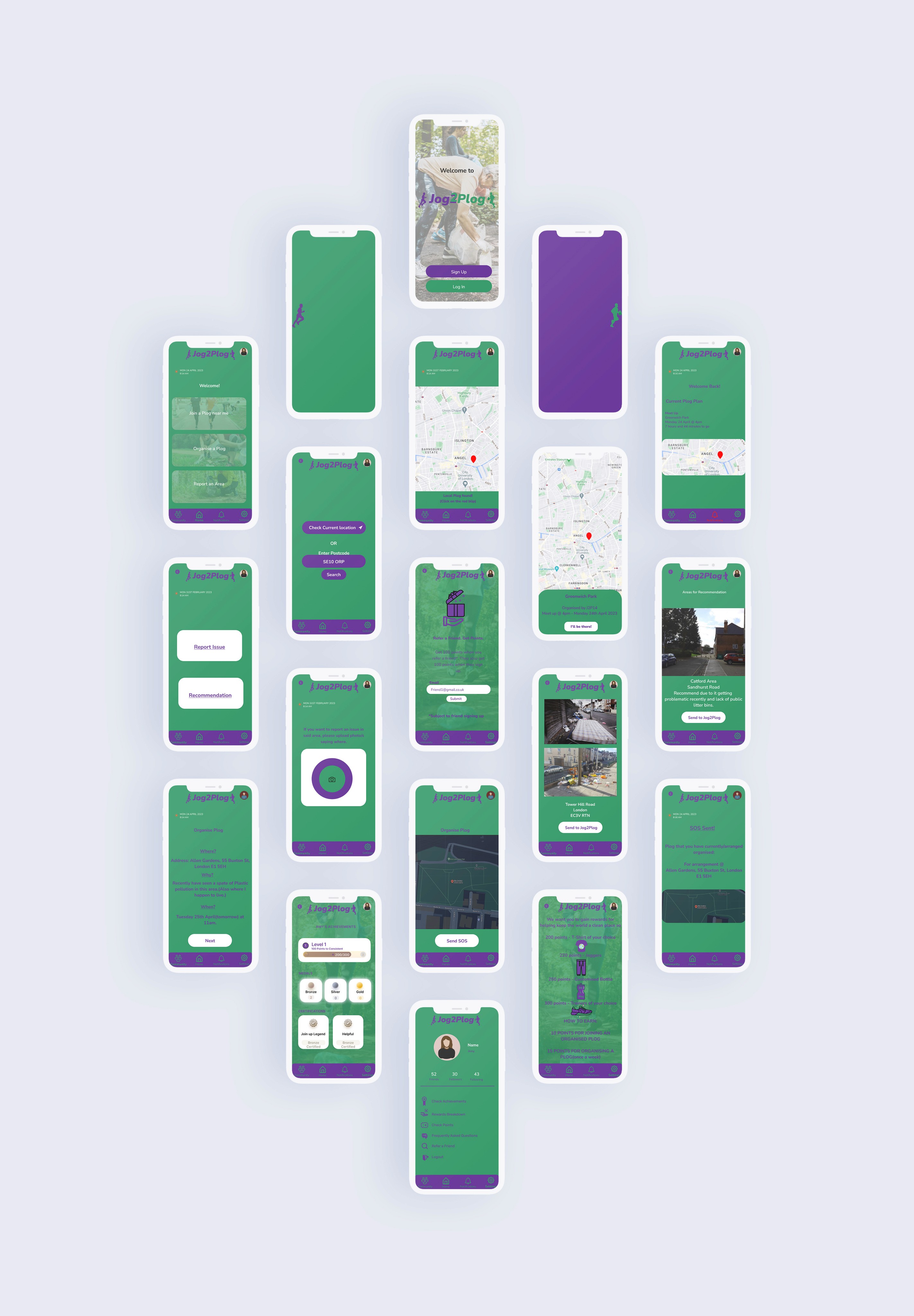
Final Design
The final design of Jog2Plog brings together all the elements developed throughout the process into a complete, user-focused app experience. With a clean layout, bold colours, and easy navigation, users can smoothly sign up, join nearby plog events, report issues, and track progress. Each screen was designed with the app’s goals in mind—encouraging physical activity and strengthening community connections.
During user testing, feedback on the final design was very positive. Testers praised the clear layout, vibrant colour scheme, and the ease of using key features like the map, event confirmation, and SOS alerts. The app felt intuitive, and users said they could see themselves using it regularly. This feedback confirmed the design is both functional and engaging, making it well-suited for real-world use.
Reflection
Other projects
Industry Brief: Suicide&Co Rebrand
A redesigned grief support app with an intuitive interface, enhanced mood tracking, and interactive features to improve user engagement and emotional support.

Expanding Experience Project: Sunglasses by Tommy
A sleek e-commerce concept combining virtual try-on technology with a clean, fashion-forward UI for seamless product discovery.