Expanding Experience Project: Sunglasses by Tommy
A sleek e-commerce concept combining virtual try-on technology with a clean, fashion-forward UI and many touchpoints for seamless product discovery improving the current, existing website.
Year
Second
Year
2023-24
Role
UX/UI Designer

Stage 1. Dissecting Brief

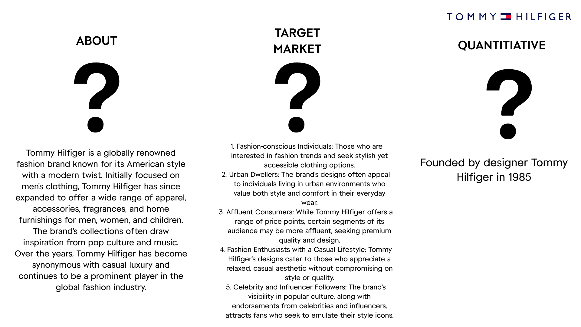
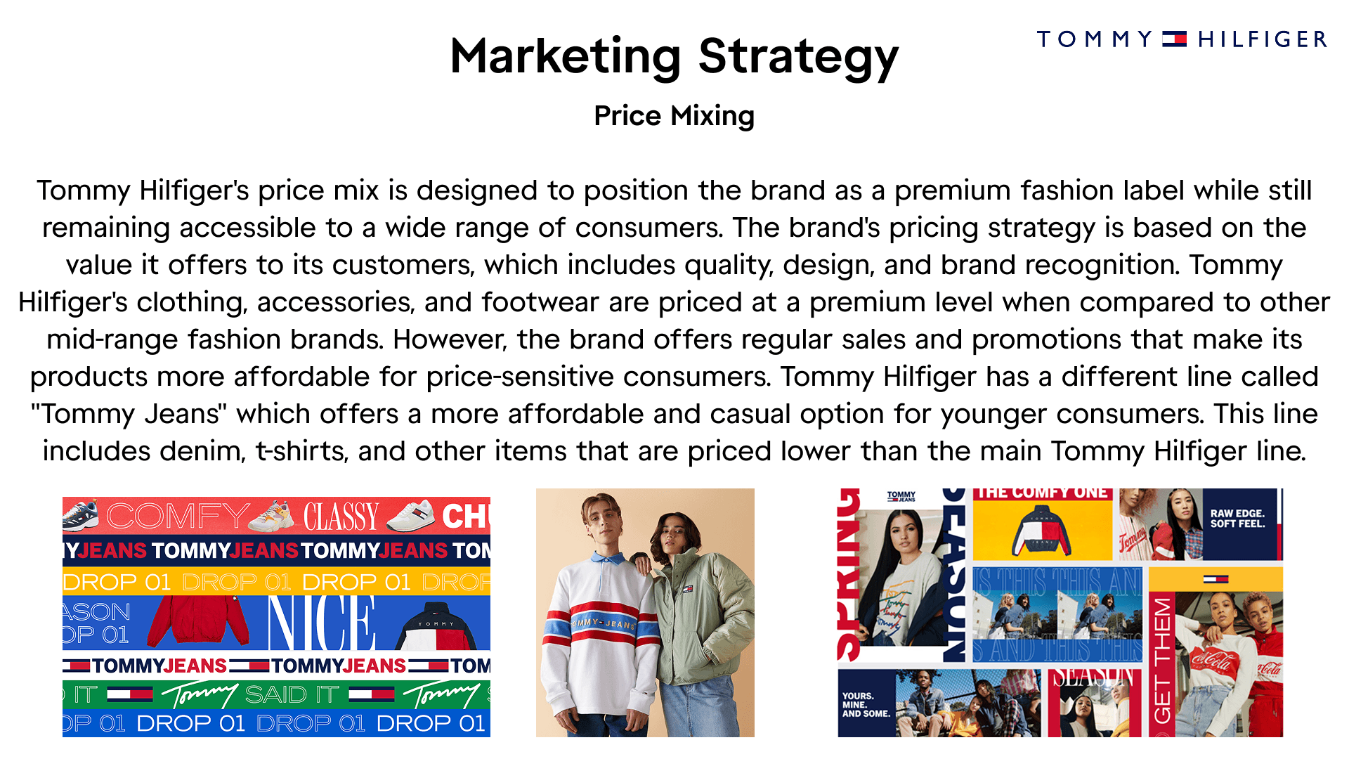
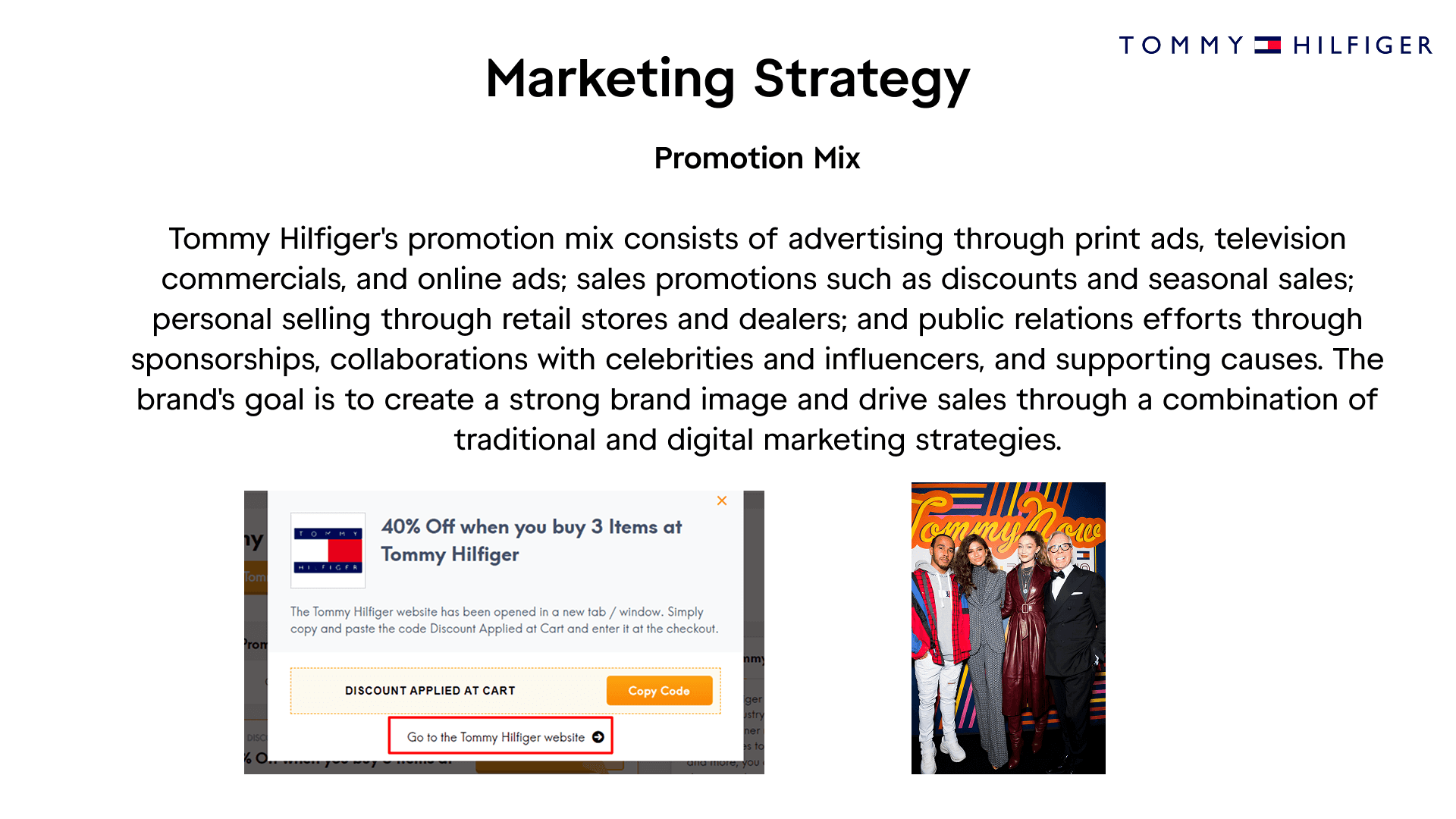
Stage 2. Brand Research
Stage 3. In-Store Research
I felt like to fully understand the Tommy Hilfiger brand I had to pay an in-store visit to get a feeling of how they operate, what they offer and what and how they ensure to keep consumers having brand loyalty.


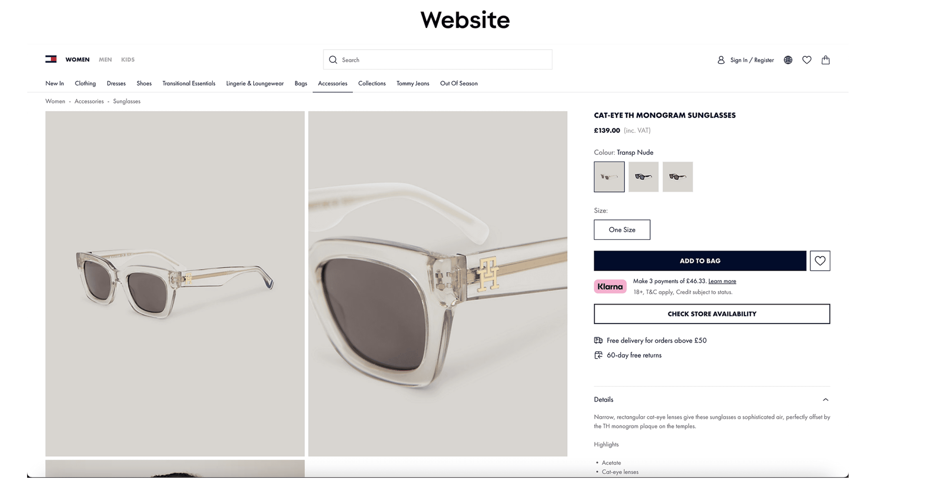
Stage 4. Website Research
Organized user testing sessions with a diverse group of participants to gather feedback on the app's usability and appeal. Utilized both in-person and remote testing methods to collect a wide range of insights.
Analyzed feedback to identify usability issues and areas for improvement. Implemented design iterations to address user concerns, enhance the app's functionality, and improve the overall user experience.


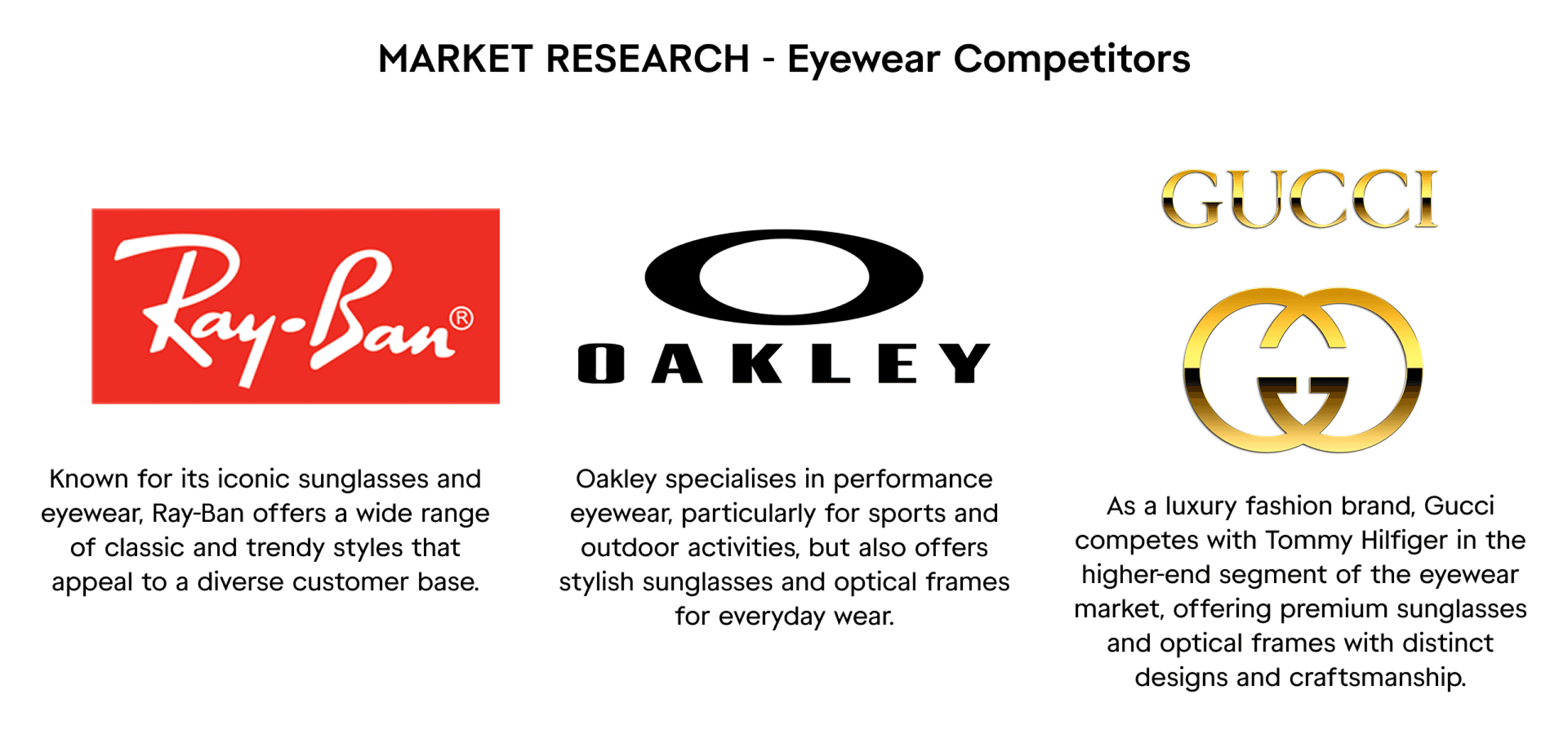
Stage 5. Market Research
Stage 6. Primary Research
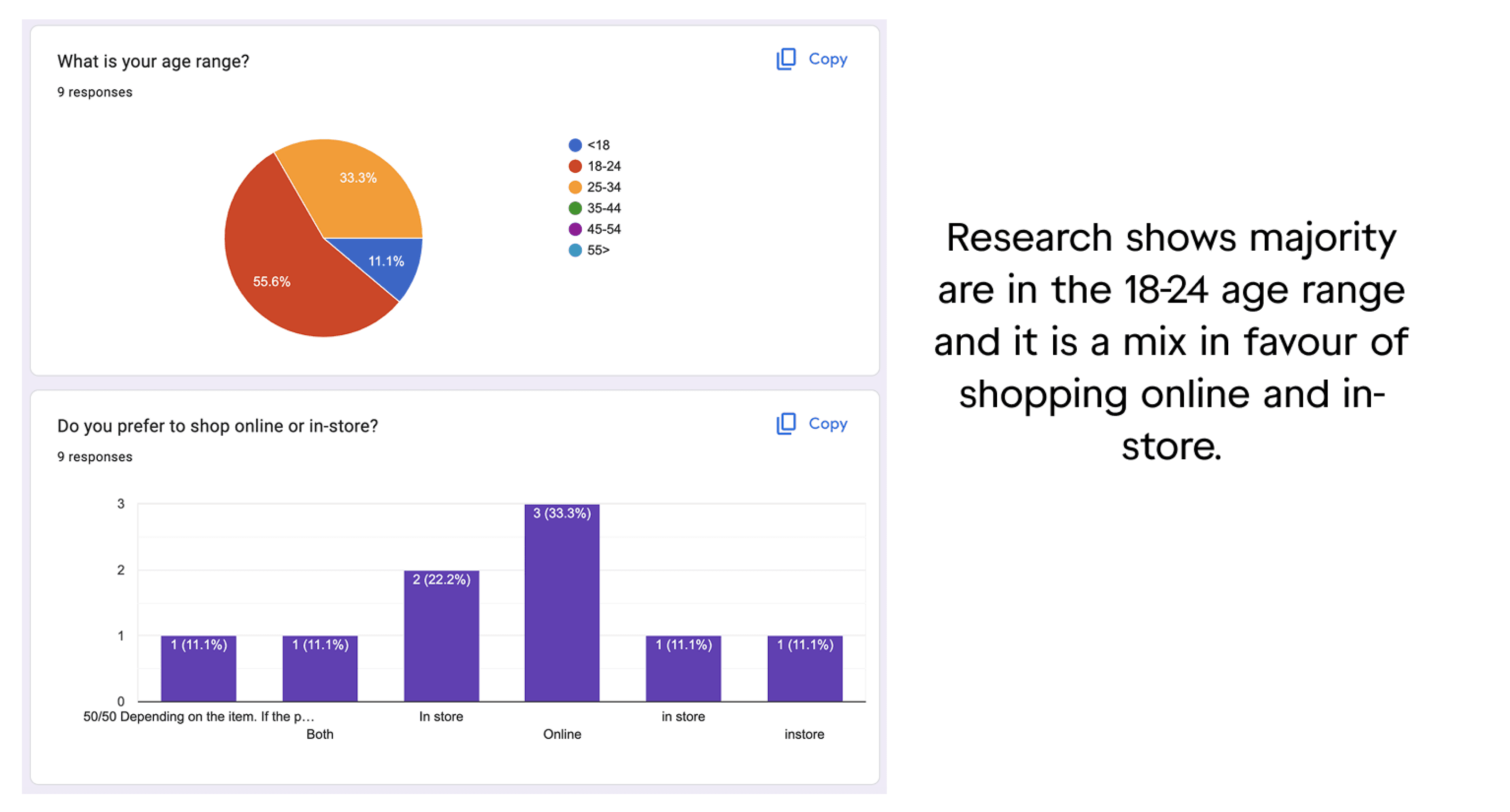
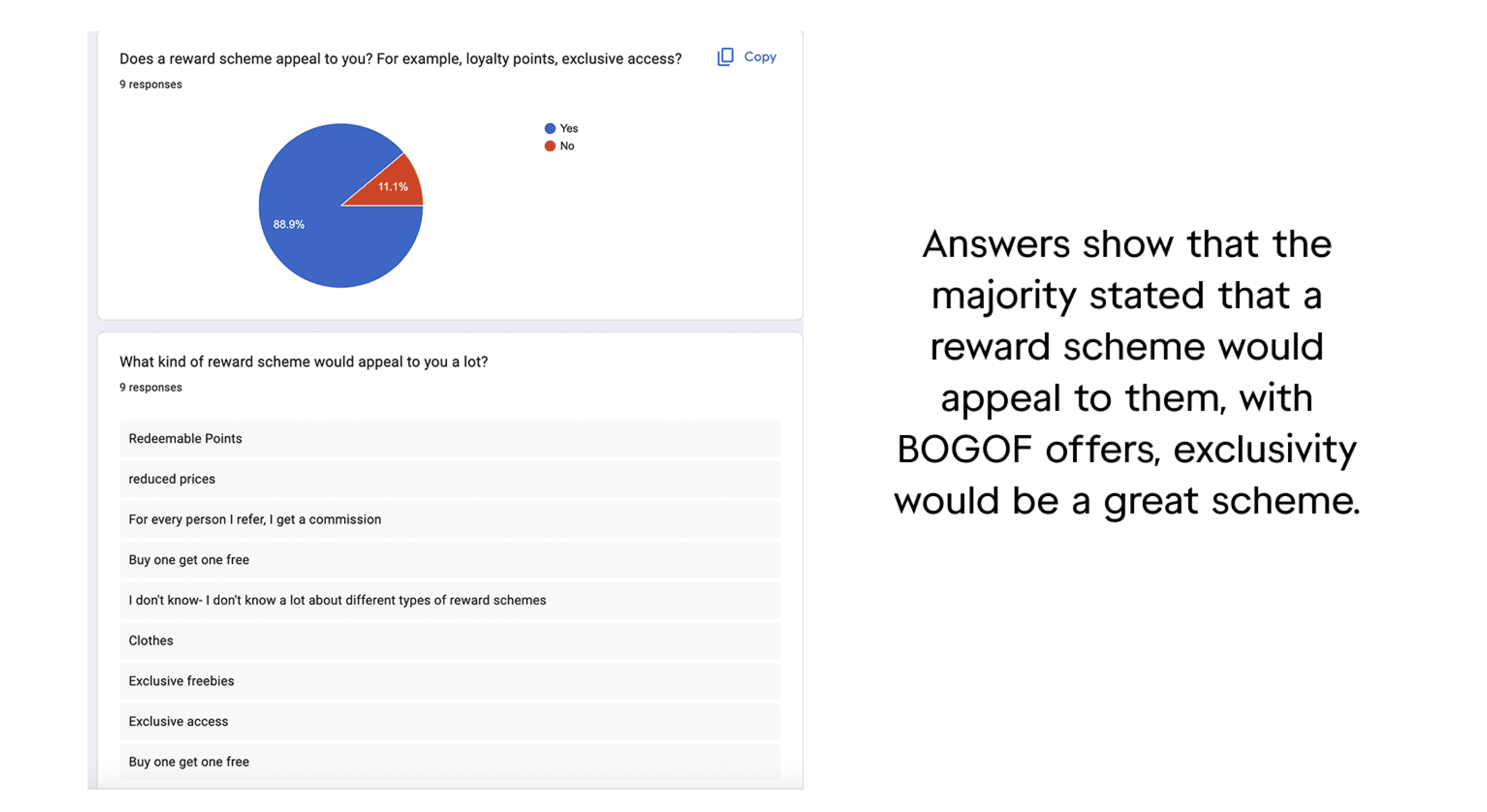
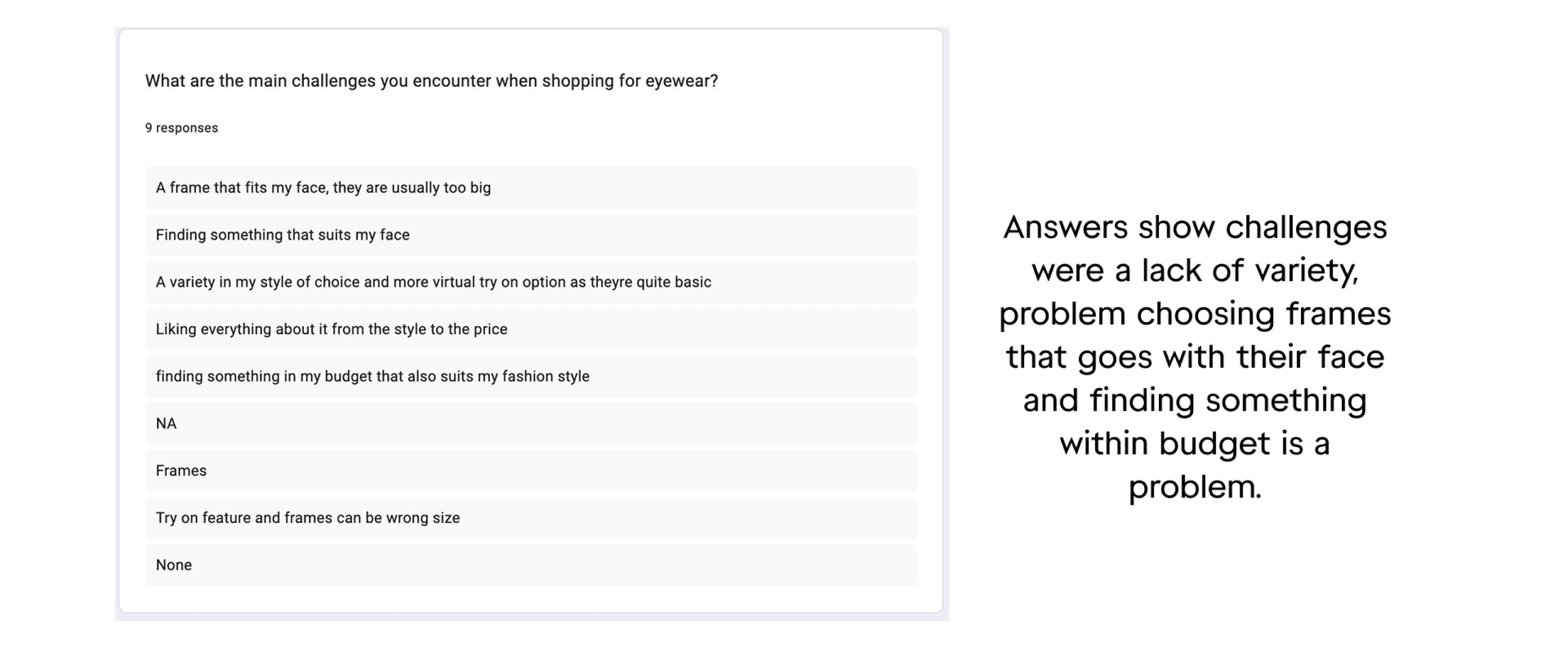
I focused on Quantitative Research and created a Google survey to ask my intended target audience regarding eyewear. I originally targeted around 20 people due to the tight turnaround it wasn’t possible and I did receive around 11 responses but had to cut it out due to not matching the overall theme. however with more time in the future and with more urgency I am confident I can gain more responses.


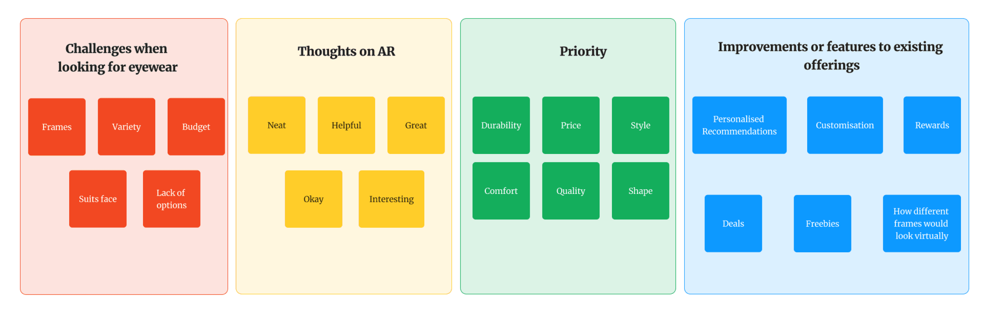
Stage 7. Affinity Diagram
The affinity diagram for the Sunglasses by Tommy project highlighted key user needs and preferences. Users struggled with frame variety, budget, and finding styles that suit their face. AR features were seen as helpful and engaging, showing promise for virtual try-ons. Priorities included durability, price, and comfort, while users also expressed interest in personalised recommendations, customisation, and rewards—guiding future feature development.
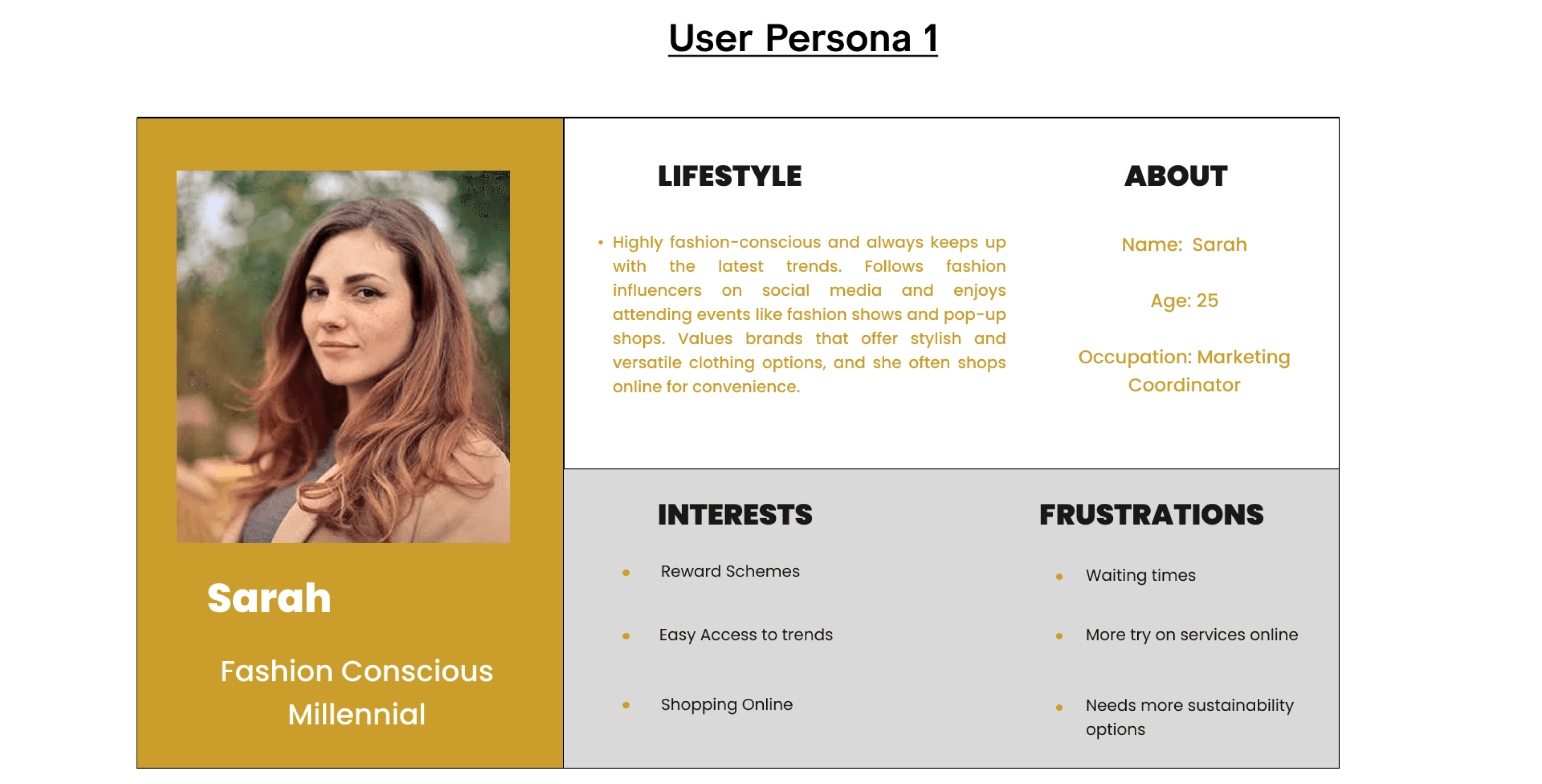
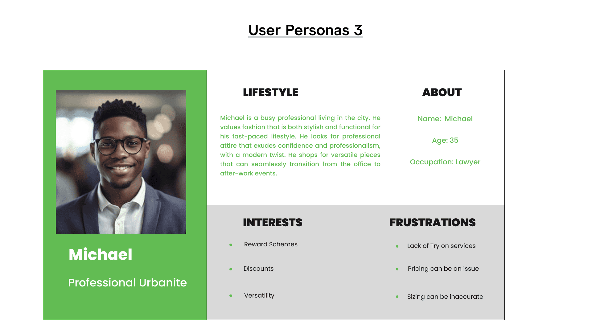
Stage 8. User Personas
The user personas created for this project capture a diverse range of style-conscious individuals with varying needs and shopping behaviours. Sarah, a fashion-forward millennial, values quick access to trends and online convenience but is frustrated by limited sustainability options and a lack of virtual try-on services. Emma, a trend-aware teenager, is budget-conscious and seeks affordability and style but also faces challenges with sizing and the absence of try-on features. Michael, a busy urban professional, appreciates versatile and stylish products that suit his fast-paced lifestyle, but finds pricing and fit accuracy to be ongoing issues. These personas helped identify key areas for improvement and informed a more tailored, user-focused design approach.

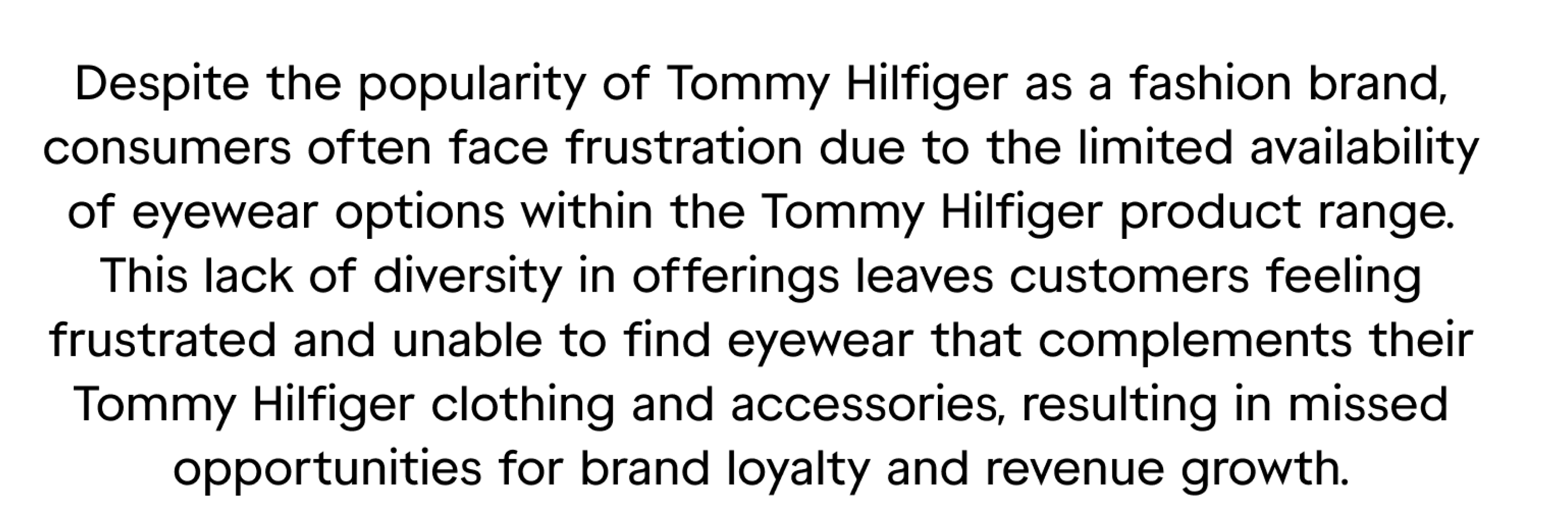
Stage 9. Problem Statement
Stage 10. Opportunity Statement

Stage 11. User Journey
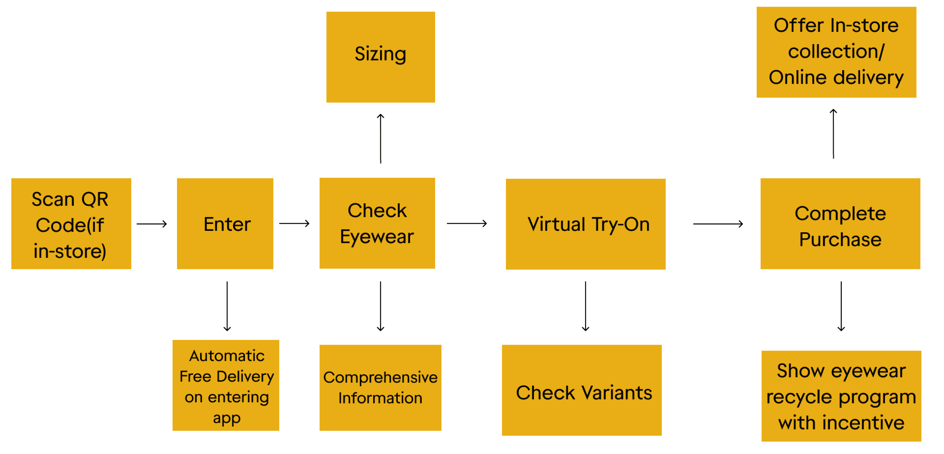
This user journey map for this project outlines a seamless and interactive experience tailored to modern shopper behaviour. It begins with a QR code scan in-store, leading users into the app where they are incentivised with automatic free delivery. From there, users can explore detailed eyewear information, including sizing and style variants, supported by a virtual try-on feature for visual confirmation. The process continues to checkout, where users can complete their purchase and choose between in-store collection or home delivery. The journey ends by promoting sustainability through an eyewear recycling programme, encouraging brand loyalty through incentives. This flow focuses on convenience, personalisation, and environmentally conscious values.
Stage 12. Service Blueprint
The service blueprint was a crucial step in my project to visualise and understand the end-to-end customer journey and the underlying service delivery process. By mapping out each touchpoint, interaction, and supporting backend processes via one of my user personas I gained a better view of the service ecosystem. This allowed me to identify pain points, inefficiencies, and opportunities for improvement within the service design delivery. Ultimately, it helped me facilitate, alignment of objectives, and informed decision-making, resulting in a more streamlined and customer-centric service experience.

Stage 13. Low Fidelity/Storyboard
Stage 14. Mid-High Fidelity/Storyboard
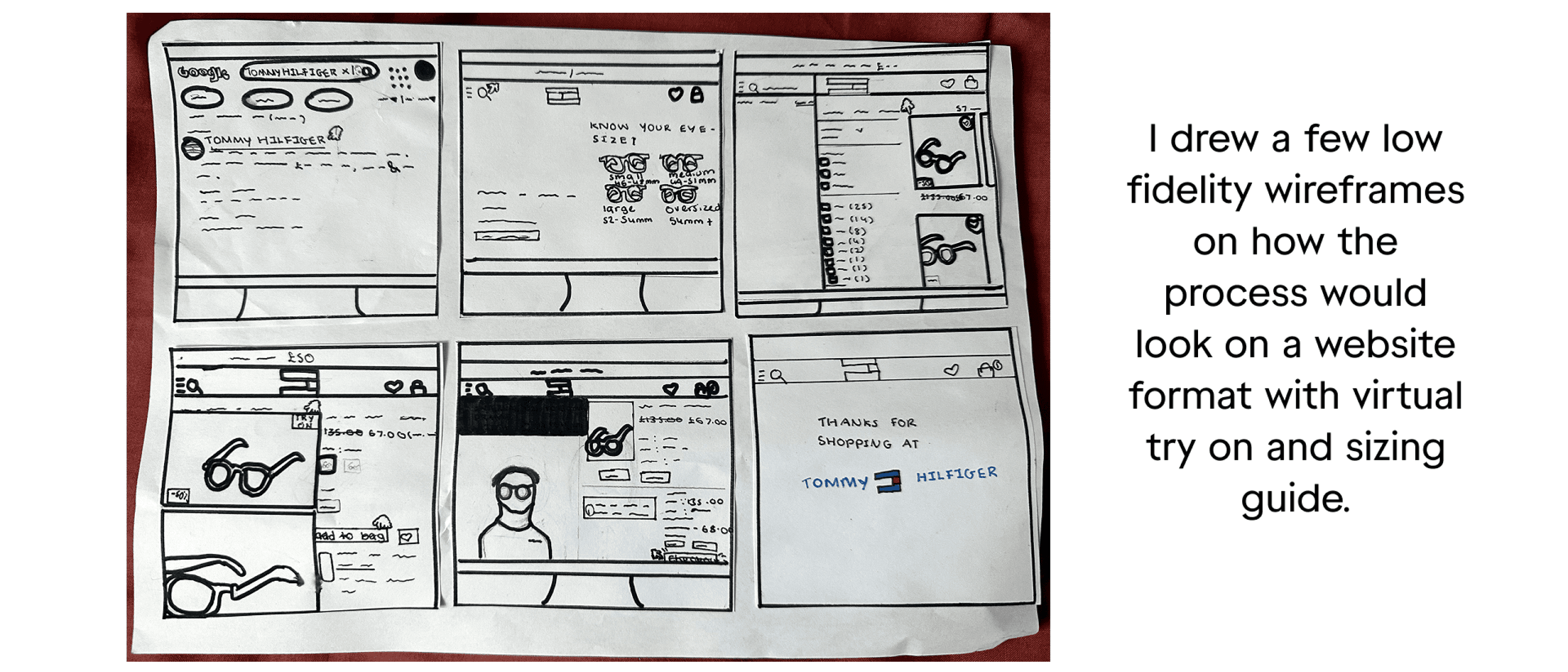
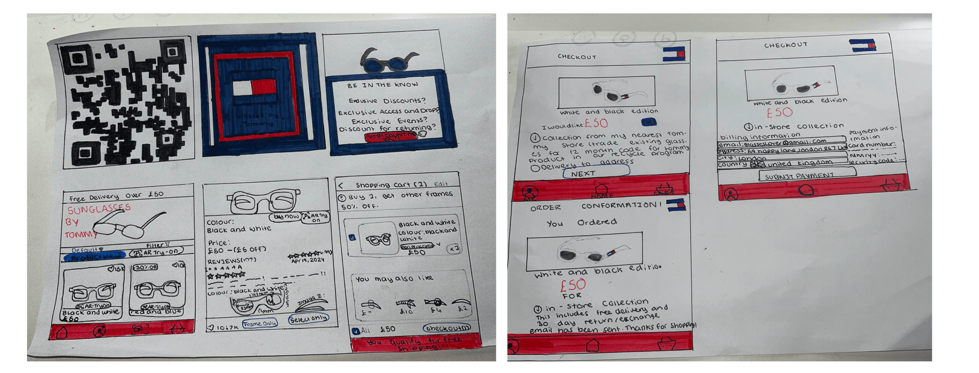
Once I explained to users via the low fidelity customer journey above and getting great feedback from them, I drew an updated customer journey/storyboard with updated intended touchpoints on how the process would look on an app format with virtual try on and sizing guide and from start to finish of the journey.
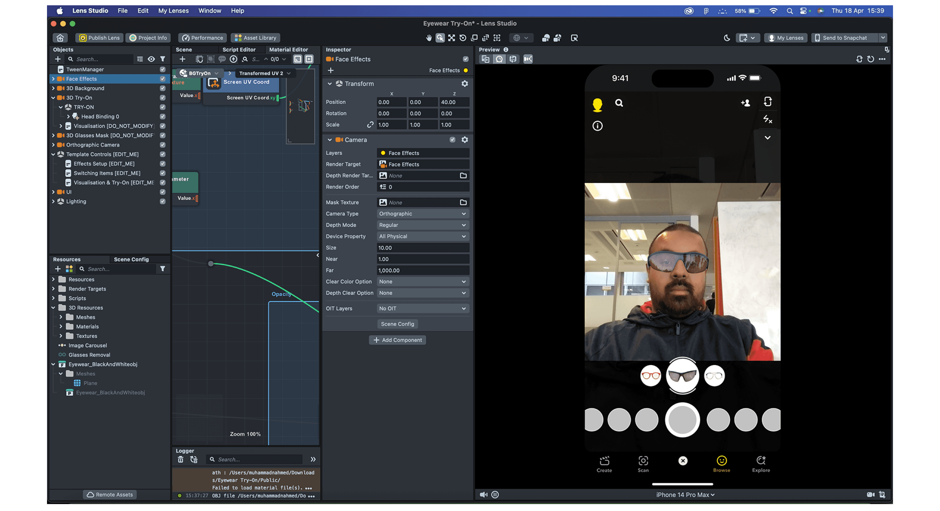
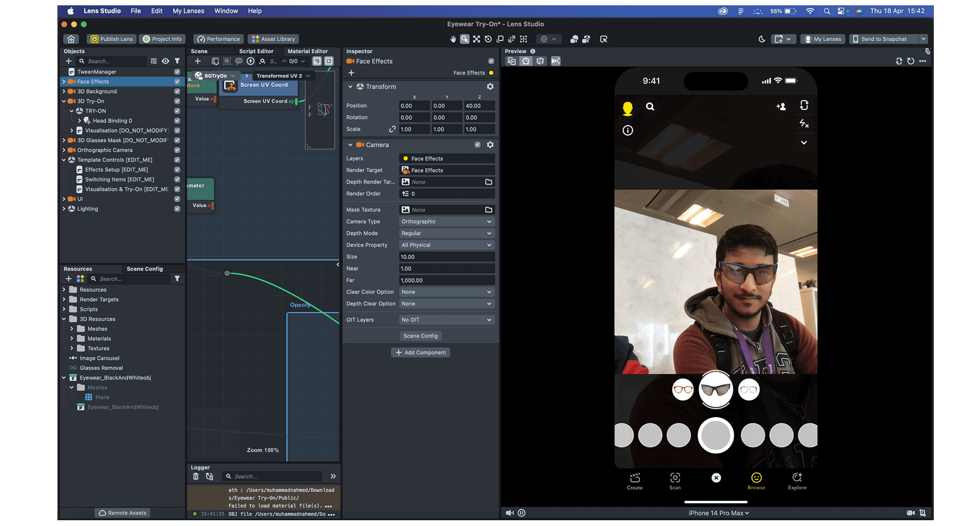
Stage 15. User Testing on Lens Studio
Once I was done designing frames on Adobe Dimension, I started user testing the models on the Lens Studio software. This allowed me to tweak anything if needed and also visualise how it would look on users.

Stage 16. Brand Board

Stage 17. Technologies Used
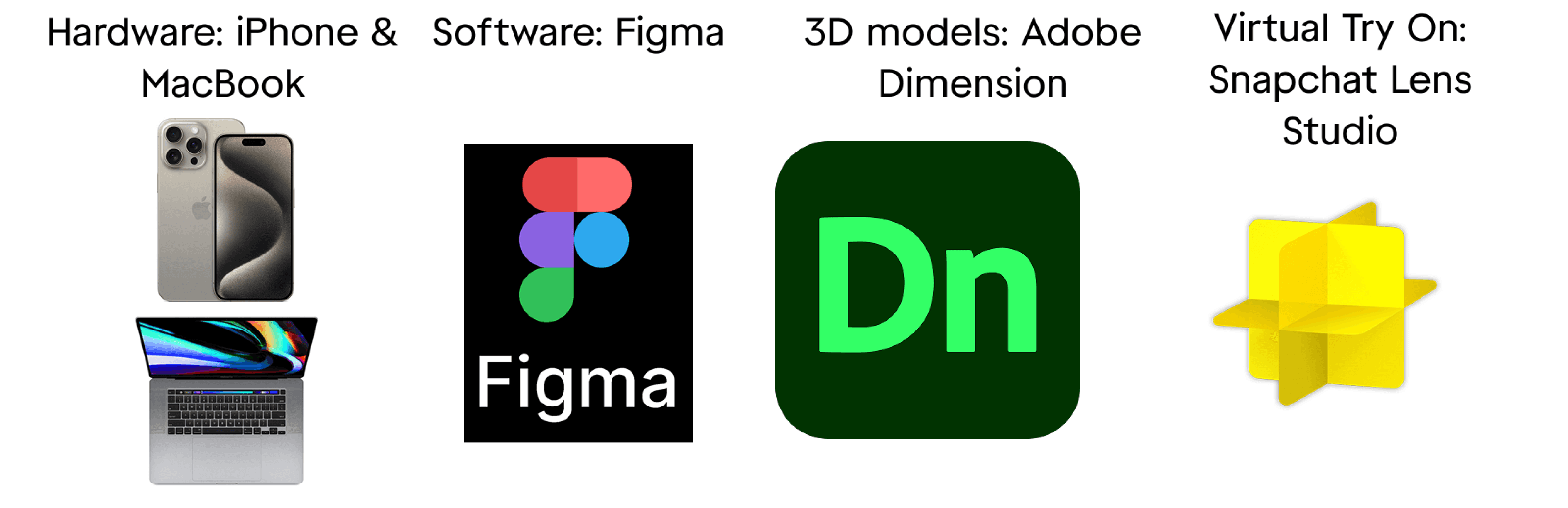
For this project, a combination of hardware and software tools was strategically used to enhance the design and user experience. The iPhone and MacBook provided a reliable platform for testing and development, ensuring compatibility across Apple devices. Figma was chosen for its collaborative design capabilities, allowing efficient prototyping and interface creation. Adobe Dimension was used to generate high-quality 3D models of the sunglasses, adding depth and realism to the visuals. Lastly, Snapchat Lens Studio enabled the integration of an interactive virtual try-on feature, making the shopping experience more engaging and personalised for users. This tech stack supported a seamless blend of creativity, usability, and innovation.
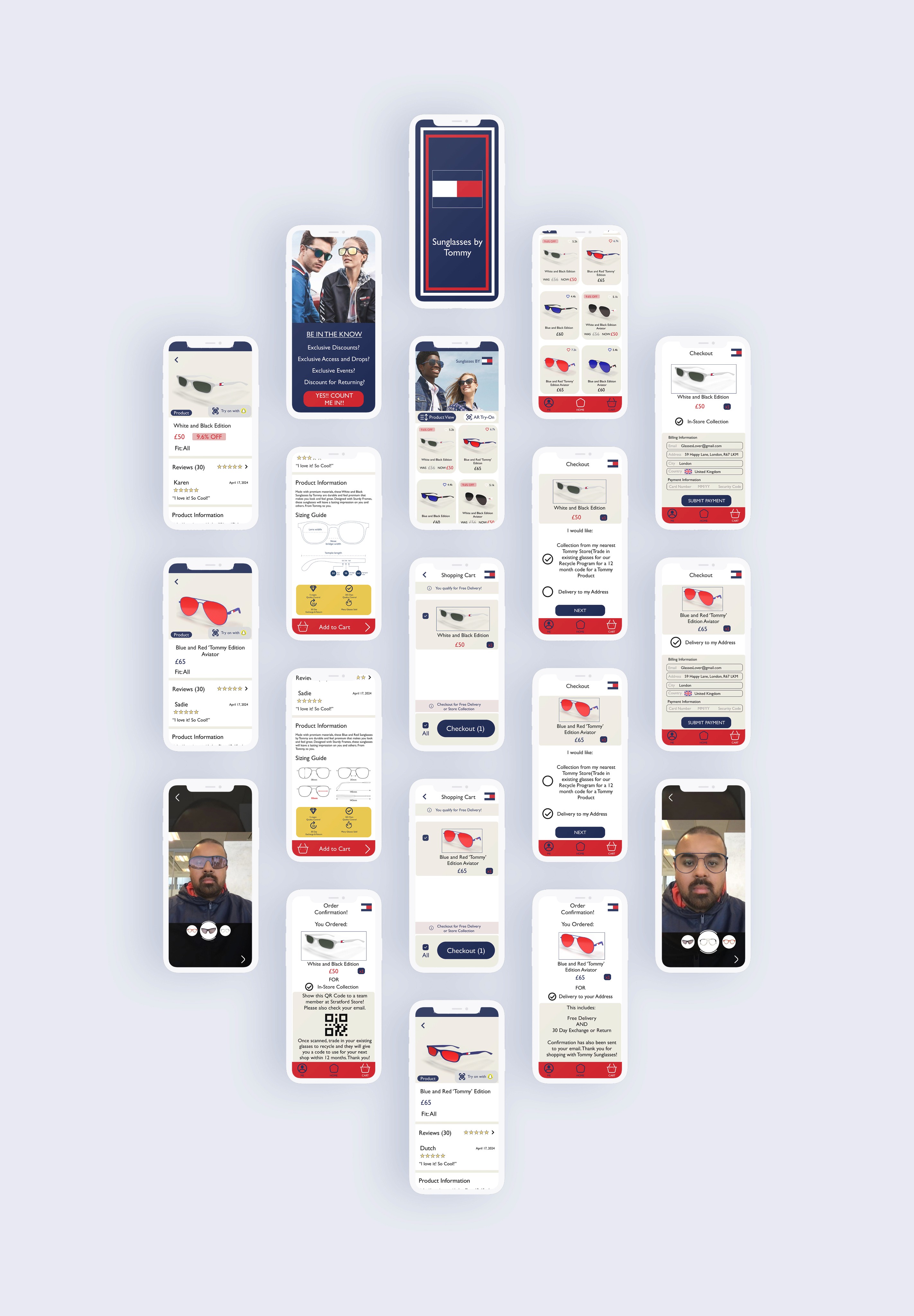
Final Design
The final design delivers a seamless, stylish, and user-friendly shopping experience tailored to modern consumers. The interface reflects the Tommy brand identity with clean layouts, bold typography, and a red, white, and blue palette. Key features include a virtual try-on powered by Snapchat Lens Studio, helping users confidently select sunglasses that suit them. Product pages highlight reviews, size guides, and clear variant options. The checkout process is smooth and flexible, offering delivery or in-store pickup. The design also integrates incentives like reward schemes and QR codes for easy access. Overall, it combines fashion and function in a sleek, engaging mobile journey.
Reflection

Other projects
5 ways of Wellbeing Project: Jog2Plog
A wellbeing app designed to encourage users to stay active and care for the environment through a user-friendly plogging experience.
Redesign project: fitness tracker App Revamp
Elevating the user experience of a renowned fitness tracker app through a strategic.
Paradigm Shift Project: Immersive Worlds
A sleek e-commerce concept combining virtual try-on technology with a clean, fashion-forward UI for seamless product discovery.
Graduation project: collaborative learning app design
Revolutionizing the educational ecosystem with a mobile app designed to enhance interactive learning and peer collaboration.