Industry Brief: Suicide&Co Rebrand
A redesigned grief support app with an intuitive interface, enhanced mood tracking, and interactive features to improve user engagement and emotional support.
Year
Second
Year
2023-24
Role
UX/UI Designer
Stage 1. Identifying Target Audience
This project targets teenagers and adults who experience grief. Although their feelings might be similar, the way they recover is different. Understanding these differences helped us design a solution that supports each group in their own way. By clearly identifying these two groups, we created an approach that connects with both teenagers and adults effectively.

Stage 2. Research and Analysis
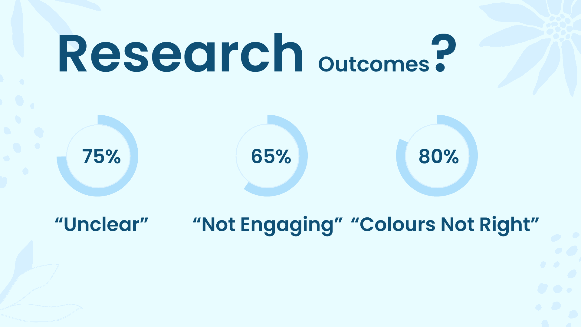
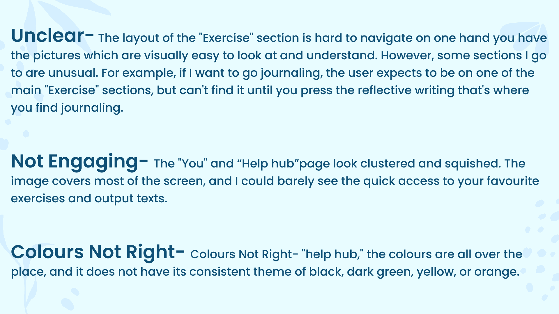
The research highlighted key issues in the current design, with most users finding the layout unclear (75%), not engaging (65%), and the colours not right (80%). Feedback showed that users struggled to navigate certain sections, like finding journaling under "Reflective Writing" rather than "Exercise." Pages such as “You” and “Help Hub” felt cramped, with visuals overpowering key content. Colour consistency was also a major concern, with clashing tones breaking the visual flow. These insights gave clear direction for improving structure, accessibility, and visual identity in the rebranding process.
Stage 3. Affinity Diagram
This affinity diagram helped organise user responses into clear patterns that guided design decisions. Users highlighted features like journaling, breathing exercises, and the help hub as most useful, showing a preference for tools that support calmness and reflection. Insights on free time revealed weekends and holidays as the most common moments for self-care, while responses about mental strength showed a journey of improvement rather than certainty. Hobbies like painting, gaming, and reading suggested the importance of creativity and personal time. These themes supported the need for a more engaging, calming, and user-focused rebrand.

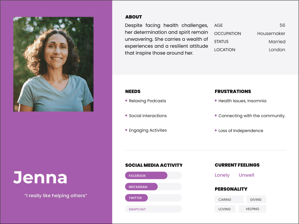
Stage 4. User Personas
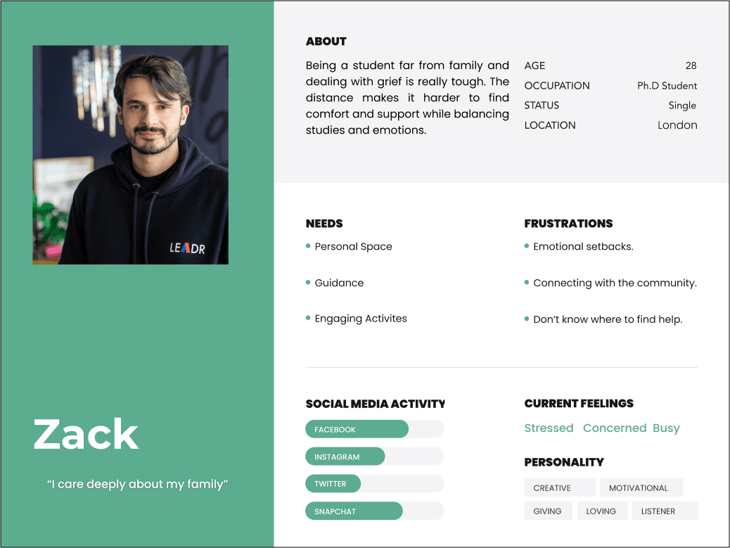
Following insights gathered from the research analysis and affinity diagram, the user personas Zack and Jenna were created to represent real user needs, emotions, and behaviours. The feedback revealed key pain points around clarity, emotional support, and visual consistency—these directly informed the creation of relatable personas.
Zack, a 28-year-old PhD student, represents users juggling emotional struggles with personal responsibilities. His need for space, guidance, and ways to stay emotionally grounded reflects the findings around unclear layout and lack of connection. Jenna, a 56-year-old homemaker, embodies those facing health-related setbacks and a need for community and purpose. Her persona links directly to insights around mental strength, support systems, and the importance of engaging, accessible content.
Together, these personas helped guide design decisions toward creating a more inclusive, supportive, and user-centred experience in the Suicide&Co rebrand.
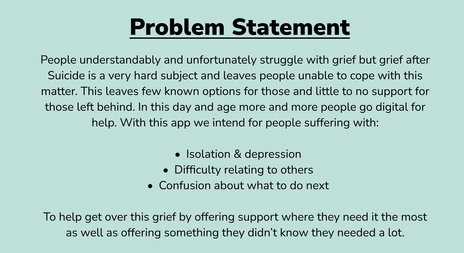
Stage 5. Problem Statement
Stage 6. User Journey
This user journey map outlines the restructured flow for the Suicide&Co rebrand, designed to offer a more supportive, calm, and personalised experience. The journey begins with gentle onboarding questions that help tailor the user’s experience based on who they’ve lost and how they’re feeling. From the Home screen, users can explore helpful features like a Mood Calendar and Breathing for Anxiety. The path continues through Resources, offering podcasts, videos, books, and services for deeper support. The structure ensures smooth navigation into Exercises, Programmes, and the Help Hub, where users can access focused areas such as Gaming and Grief, Befriending Services, and Guidance. This flow reflects key research insights, ensuring clarity, emotional safety, and ease of access to meaningful tools.

Stage 7. Low Fidelity Wireframes
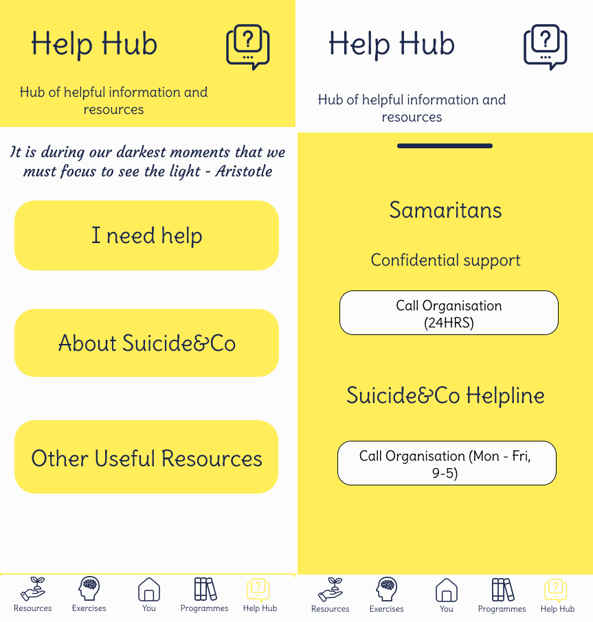
These low fidelity wireframes helped shape the core structure of the Suicide&Co rebrand with a focus on accessibility, emotional support, and ease of use. The homepage introduces the user to the platform with a clean layout and a simple question-based entry to personalise their experience. The mood calendar update screen allows users to track how they’re feeling over time—supporting emotional self-awareness. The exercises page showcases a grid of interactive tools, where users can engage in therapeutic activities and also monitor their progress. Lastly, the Help Hub page groups key support areas like Befriending, Gaming and Grief, and Guidance, making resources easy to find and navigate. These wireframes prioritise clarity and emotional safety, reflecting the needs highlighted through earlier user research.
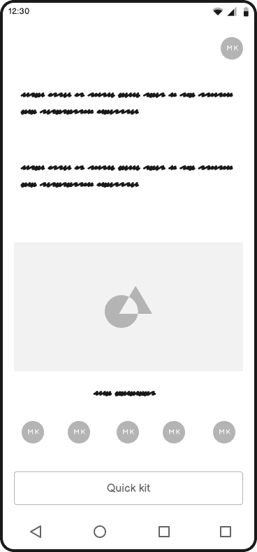
Homepage

Update Mood Calendar
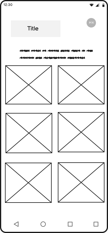
Exercises

Help Hub
Stage 8. Elevator Pitch
Stage 9. High Fidelity Wireframes
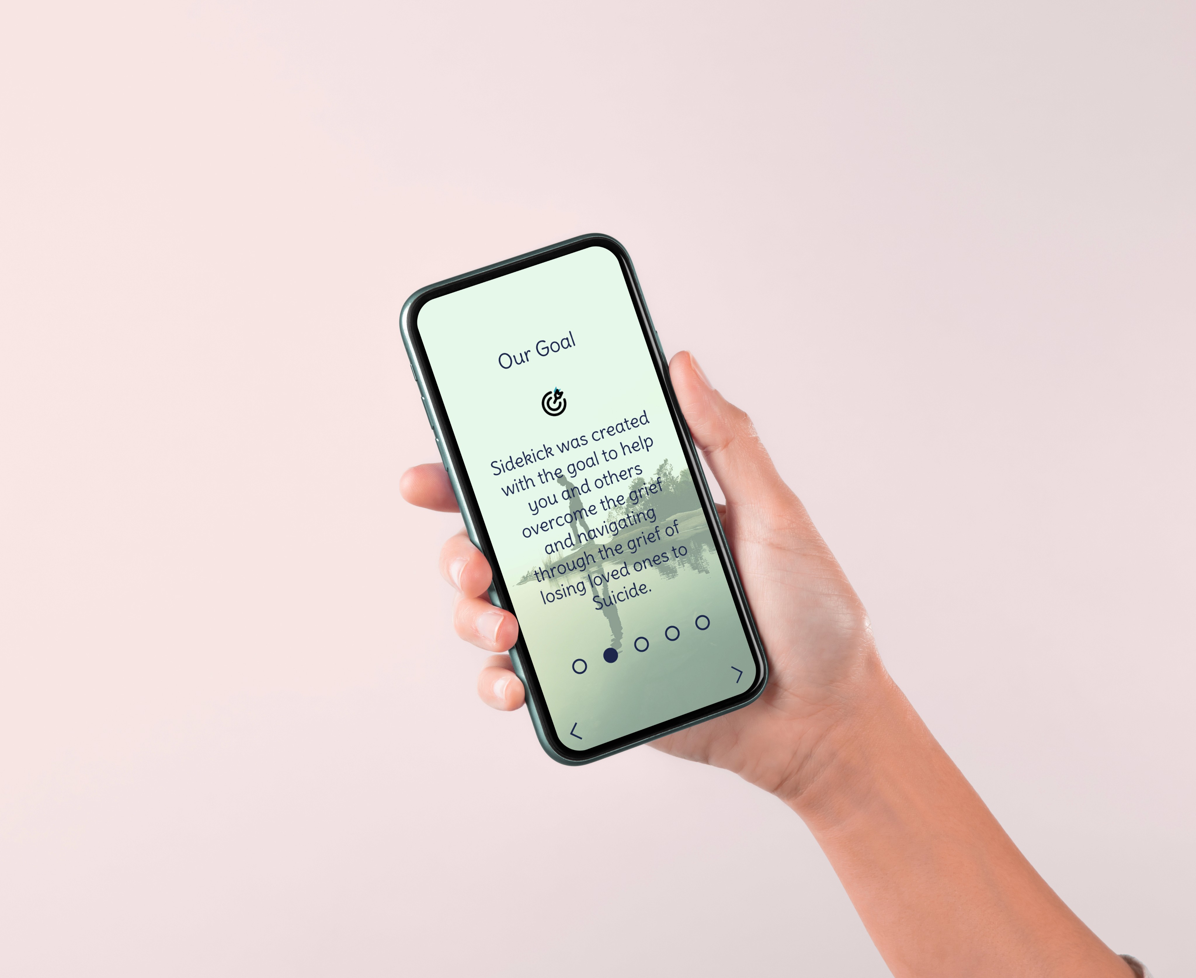
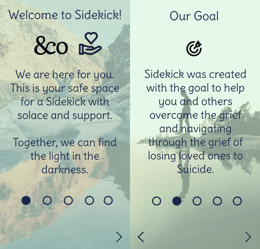
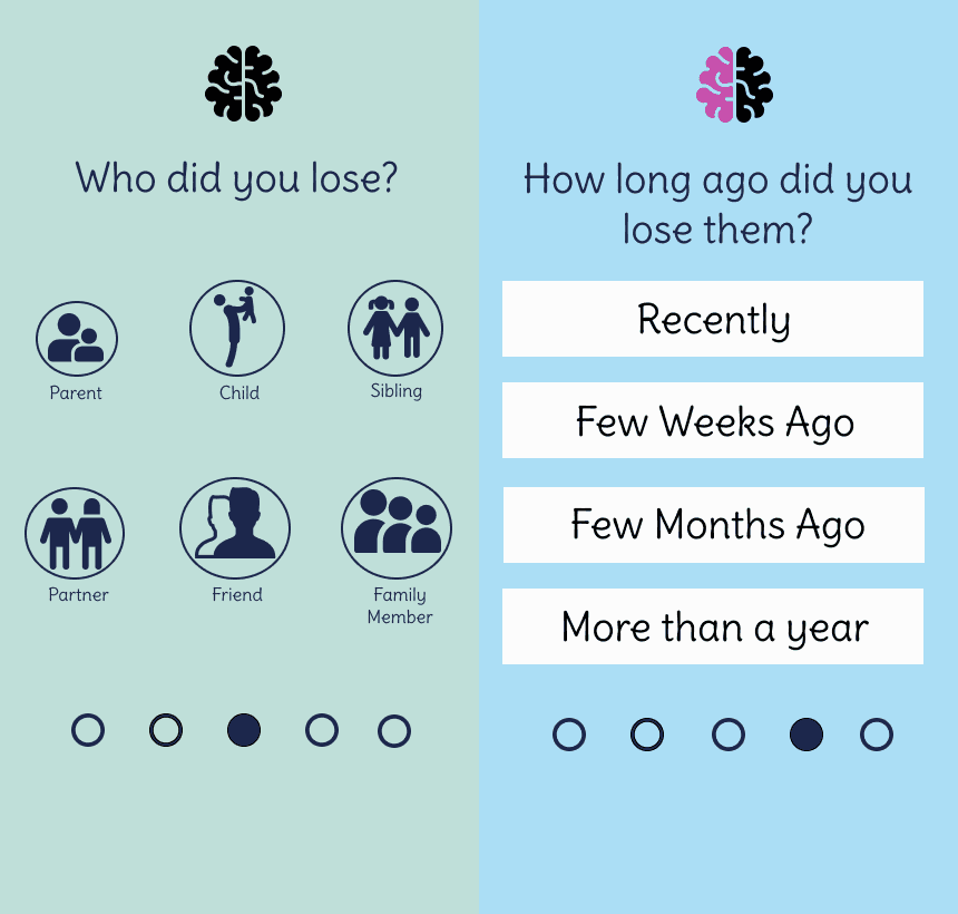
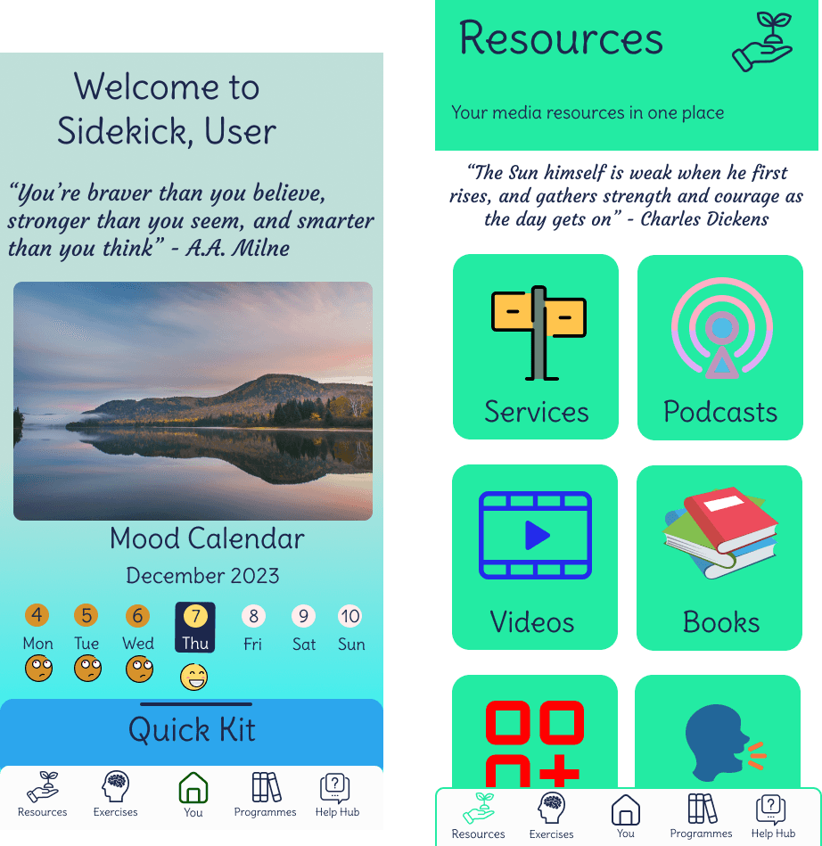
These high fidelity wireframes for the Suicide&Co rebrand reflect a calming, user-focused design that supports those grieving a loss to suicide. The welcome and goal screens set a supportive tone, while personalised prompts like “Who did you lose?” guide tailored support. Quick access tools like meditation and mood tracking offer instant relief, and the homepage neatly organises helpful resources like podcasts, videos, and services. Exercises and programmes allow users to track progress and build healthy habits, and the Help Hub makes crisis support clear and accessible. Overall, the design is gentle, intuitive, and shaped by user research to create a safe and helpful experience.


Stage 10. High Fidelity User Testing
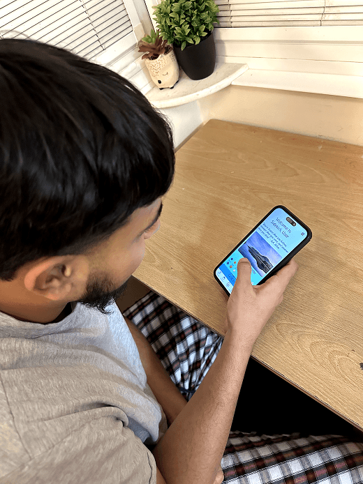
The high-fidelity user testing for the Suicide&Co rebrand project received highly positive feedback, particularly around the app’s welcoming tone and visual clarity. Testers highlighted how the calming aesthetic and clear layout helped create a comforting first impression—crucial for users navigating grief. The mood calendar, quote integration, and straightforward navigation across key support features like meditation and the help hub were especially praised. Testers found the interface intuitive and appreciated how the emotional support tools were easily accessible. Overall, the design was seen as empathetic, user-friendly, and well-aligned with the project's purpose.

Stage 11. Brand Board
This UI design components board for the Suicide&Co rebrand project reflects a thoughtful and empathetic visual language tailored for users navigating grief. The selected icons are simple and intuitive, ensuring accessibility and ease of navigation across key sections like Home, Resources, and Help Hub. The use of the Delius Swash Caps and Delius fonts adds a soft, personal touch that complements the supportive tone of the app. The carefully chosen colour palette balances vibrancy and calm, using shades like #FD8F04 (orange) and #23EBA3 (mint green) to evoke warmth and reassurance. The emojis and expressive icons enhance emotional connection, allowing users to identify and communicate their feelings easily—an essential aspect in a mental health context. Altogether, these design components create a cohesive, welcoming, and emotionally supportive user experience

Final Design
The final design of the Sidekick app for the Suicide&Co rebrand presents a compassionate and user-centric interface that guides individuals through grief with warmth and clarity. These high-fidelity mockups showcase a fully realised digital support tool, featuring personalised onboarding, a mood calendar, structured exercises, and easily accessible resources. Vibrant yet soothing colours, friendly illustrations, and emotionally resonant language contribute to a safe and supportive experience. The app's intuitive layout ensures users can navigate between tools—such as guided programmes and the Help Hub—with ease, reinforcing a sense of control and comfort. This thoughtful design aims to empower users in their healing journey through both structure and sensitivity.

Reflection

Other projects
5 ways of Wellbeing Project: Jog2Plog
A wellbeing app designed to encourage users to stay active and care for the environment through a user-friendly plogging experience.
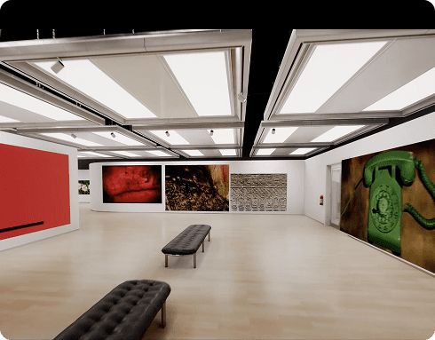
Paradigm Shift Project: Immersive Worlds
An interactive, silent art gallery exploring communication through minimalist navigation and immersive UX to evoke reflection without words.